Verdigris
I do like that word. Good thing I took French in school, huh?
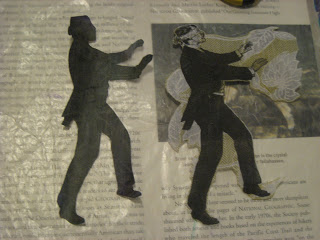
Oh so many moons ago in one of Michael de Meng's classes, I learned a trick to create that patina look with acrylics. For the first time, I got the colors to blend the right way!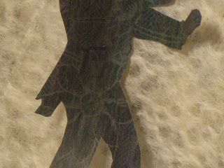 I was going to cut up the shadow image and use it in a couple of ATCs.
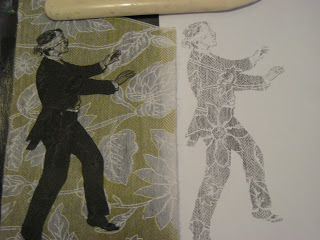 But yesterday I changed my mind.
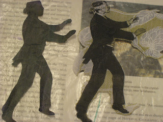 Paper soaks up paint, of course, unless you seal it with a barrier of matte medium. Michael explained that barrier -- which is basically acrylic paint without the color -- allows more paint to sit on top of the paper and blend properly.
In this case, I painted thin layers of glaze, rather than straight color or watered-down color. That allowed the shadow of the patterned paper to remain more visible.
Since the color turned out so well, I decided to use it more literally as a shadow on the page. I also created clouds with torn lace paper and this soft, fuzzy black paper I've had for a while.
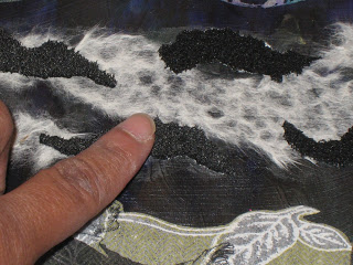 The black paper brings in an element of softness I'd wanted. (BTW kids, don't use a heat gun to dry paint, or anything else, near the fuzzy paper. It melts. The result: a hard, flattened surface kind of like the edges of macaroni and cheese that's been overheated in the microwave.)
 I may need to blend the edges of the patterned paper with more paint. But I just might leave it that way anyhow. I think the untouched paper draws the eye to the herringbone and flower pattern that's partly covered by the printer ink.
Oh so many moons ago in one of Michael de Meng's classes, I learned a trick to create that patina look with acrylics. For the first time, I got the colors to blend the right way!
I was going to cut up the shadow image and use it in a couple of ATCs.
But yesterday I changed my mind.
Paper soaks up paint, of course, unless you seal it with a barrier of matte medium. Michael explained that barrier -- which is basically acrylic paint without the color -- allows more paint to sit on top of the paper and blend properly.
In this case, I painted thin layers of glaze, rather than straight color or watered-down color. That allowed the shadow of the patterned paper to remain more visible.
Since the color turned out so well, I decided to use it more literally as a shadow on the page. I also created clouds with torn lace paper and this soft, fuzzy black paper I've had for a while.
The black paper brings in an element of softness I'd wanted. (BTW kids, don't use a heat gun to dry paint, or anything else, near the fuzzy paper. It melts. The result: a hard, flattened surface kind of like the edges of macaroni and cheese that's been overheated in the microwave.)
I may need to blend the edges of the patterned paper with more paint. But I just might leave it that way anyhow. I think the untouched paper draws the eye to the herringbone and flower pattern that's partly covered by the printer ink.