Sixth anniversary
This one is all about keeping it simple.
 If you're new to le blog, let me tell you that I try to make a piece of art for The Husband for our anniversary each year. This time around, I wanted to make this year's piece relatively quickly. Last year's was great fun to make, but it was quite labor- and idea-intensive. And for our three-year anniversary, I had to put off making the art until Father's Day.
But I didn't want to delay again. And now that I have Kids instead of A Kid, who knows how long it would take to finish. Even though we're pretty much settled into a routine with TwoBoo, he's still 4.5 months old. You never know when he'll decide he wants to hang out and socialize instead of sleep.
So I decided to go monochromatic. One color, varied textures. That way, I narrow down the possibilities in a creative way and maximize the time I have to actually put the piece together.
As background, I used this white paper with twig inclusions I'd bought years ago (when I first discovered my paper jones). I also found a lotería card, which could be toned down with a scrap of cream lace paper.
Then I flipped the orientation of a childhood picture of The Husband, in Photoshop, so the transferred image would face the right way. (Remember, kids, if you're going to do a transfer, your images are going to be mirror images of the original.)
 I layered a picture of The Boy and me on top of the larger picture. Both images are transferred onto watercolor paper which has just enough texture to make it interesting. I just used a regular old (acid-free) glue stick to adhere everything. It's drier than glue or matte medium, and would not make the lace paper disappear on the lotería card.
 Finally, I pinned the piece into a shadow box. It's a much better composition than the first shadowbox I did for The Husband -- that one I kinda threw in everything but the kitchen sink.
But where's TwoBoo? I know, I know. But I couldn't really figure a way to incorporate his image into the piece without it looking shoe-horned in. TwoBoo is in there -- I'm five months pregnant in this picture. You just can't see it because The Boy is sitting in my rapidly-shrinking lap.
Recurring artistic choices: transfers, textured & lace paper, bright colors muted (by layering).
If you're new to le blog, let me tell you that I try to make a piece of art for The Husband for our anniversary each year. This time around, I wanted to make this year's piece relatively quickly. Last year's was great fun to make, but it was quite labor- and idea-intensive. And for our three-year anniversary, I had to put off making the art until Father's Day.But I didn't want to delay again. And now that I have Kids instead of A Kid, who knows how long it would take to finish. Even though we're pretty much settled into a routine with TwoBoo, he's still 4.5 months old. You never know when he'll decide he wants to hang out and socialize instead of sleep.
So I decided to go monochromatic. One color, varied textures. That way, I narrow down the possibilities in a creative way and maximize the time I have to actually put the piece together.
As background, I used this white paper with twig inclusions I'd bought years ago (when I first discovered my paper jones). I also found a lotería card, which could be toned down with a scrap of cream lace paper.
Then I flipped the orientation of a childhood picture of The Husband, in Photoshop, so the transferred image would face the right way. (Remember, kids, if you're going to do a transfer, your images are going to be mirror images of the original.)
I layered a picture of The Boy and me on top of the larger picture. Both images are transferred onto watercolor paper which has just enough texture to make it interesting. I just used a regular old (acid-free) glue stick to adhere everything. It's drier than glue or matte medium, and would not make the lace paper disappear on the lotería card.Finally, I pinned the piece into a shadow box. It's a much better composition than the first shadowbox I did for The Husband -- that one I kinda threw in everything but the kitchen sink.But where's TwoBoo? I know, I know. But I couldn't really figure a way to incorporate his image into the piece without it looking shoe-horned in. TwoBoo is in there -- I'm five months pregnant in this picture. You just can't see it because The Boy is sitting in my rapidly-shrinking lap.
Recurring artistic choices: transfers, textured & lace paper, bright colors muted (by layering).
That's just weird.
When did Pez dispensers become fuzzy?
What if I get fake fur in my mouth while fishing out the Pez candy with my tongue?
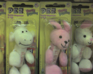
Ick.
... The dark sacred night
 There's a reason why I'm making you crane your neck sideways.
 See?
See?All done. We are pleased at the way this one turned out.
 You might recognize the phrase from Louis Armstrong's What a Wonderful World:
I see skies of blue... and clouds of white
The bright blessed day
The dark sacred night
And I think to myself... what a wonderful world
The bright blessed day
The dark sacred night
And I think to myself... what a wonderful world
I admit it: I fell in love with the song when I heard it in Good Morning Vietnam. But it got me to get a CD of Armstrong songs.
And the "dark sacred night" really held me. It captures so many things I like about darkness and nighttime. Listening to a sleeping child breathe. The feeling just before you slide into sleep. Entering your home at the end of the work week.
 I got rid of the first version of this page, but I did salvage the "stones" I made from those cinchers that close bags of bread at the supermarket. (I have no idea if that's what they're really called.)
 I thought I hadn't used any technique I learned in LK's class, but then I remembered she suggested printing images on different papers. Isn't it cool how the pattern came through even more as the ink dried?
Recurring artistic choices: textured paper, extra-lightweight paper (like lace paper), acrylic paint on paper, antique drawing. (I finally realized why I like the old-fashioned drawings. I grew up looking at them in the Trader Joe's mailers. Goofy, huh?)
That's the stuff.