... The dark sacred night
 There's a reason why I'm making you crane your neck sideways.
 See?
All done. We are pleased at the way this one turned out.
 You might recognize the phrase from Louis Armstrong's What a Wonderful World:
I see skies of blue... and clouds of white
The bright blessed day
The dark sacred night
And I think to myself... what a wonderful world
The bright blessed day
The dark sacred night
And I think to myself... what a wonderful world
I admit it: I fell in love with the song when I heard it in Good Morning Vietnam. But it got me to get a CD of Armstrong songs.
And the "dark sacred night" really held me. It captures so many things I like about darkness and nighttime. Listening to a sleeping child breathe. The feeling just before you slide into sleep. Entering your home at the end of the work week.
 I got rid of the first version of this page, but I did salvage the "stones" I made from those cinchers that close bags of bread at the supermarket. (I have no idea if that's what they're really called.)
 I thought I hadn't used any technique I learned in LK's class, but then I remembered she suggested printing images on different papers. Isn't it cool how the pattern came through even more as the ink dried?
Recurring artistic choices: textured paper, extra-lightweight paper (like lace paper), acrylic paint on paper, antique drawing. (I finally realized why I like the old-fashioned drawings. I grew up looking at them in the Trader Joe's mailers. Goofy, huh?)
That's the stuff.
Verdigris
I do like that word. Good thing I took French in school, huh?
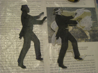
Oh so many moons ago in one of Michael de Meng's classes, I learned a trick to create that patina look with acrylics. For the first time, I got the colors to blend the right way!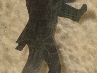 I was going to cut up the shadow image and use it in a couple of ATCs.
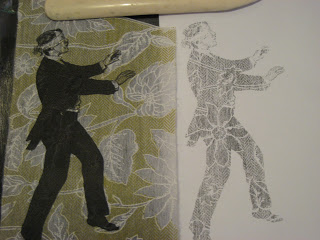 But yesterday I changed my mind.
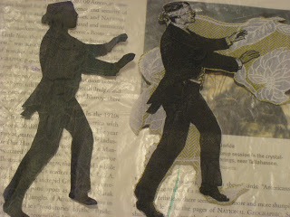 Paper soaks up paint, of course, unless you seal it with a barrier of matte medium. Michael explained that barrier -- which is basically acrylic paint without the color -- allows more paint to sit on top of the paper and blend properly.
In this case, I painted thin layers of glaze, rather than straight color or watered-down color. That allowed the shadow of the patterned paper to remain more visible.
Since the color turned out so well, I decided to use it more literally as a shadow on the page. I also created clouds with torn lace paper and this soft, fuzzy black paper I've had for a while.
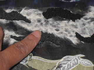 The black paper brings in an element of softness I'd wanted. (BTW kids, don't use a heat gun to dry paint, or anything else, near the fuzzy paper. It melts. The result: a hard, flattened surface kind of like the edges of macaroni and cheese that's been overheated in the microwave.)
 I may need to blend the edges of the patterned paper with more paint. But I just might leave it that way anyhow. I think the untouched paper draws the eye to the herringbone and flower pattern that's partly covered by the printer ink.
Oh so many moons ago in one of Michael de Meng's classes, I learned a trick to create that patina look with acrylics. For the first time, I got the colors to blend the right way!
I was going to cut up the shadow image and use it in a couple of ATCs.But yesterday I changed my mind. Paper soaks up paint, of course, unless you seal it with a barrier of matte medium. Michael explained that barrier -- which is basically acrylic paint without the color -- allows more paint to sit on top of the paper and blend properly.In this case, I painted thin layers of glaze, rather than straight color or watered-down color. That allowed the shadow of the patterned paper to remain more visible.
Since the color turned out so well, I decided to use it more literally as a shadow on the page. I also created clouds with torn lace paper and this soft, fuzzy black paper I've had for a while.
The black paper brings in an element of softness I'd wanted. (BTW kids, don't use a heat gun to dry paint, or anything else, near the fuzzy paper. It melts. The result: a hard, flattened surface kind of like the edges of macaroni and cheese that's been overheated in the microwave.)I may need to blend the edges of the patterned paper with more paint. But I just might leave it that way anyhow. I think the untouched paper draws the eye to the herringbone and flower pattern that's partly covered by the printer ink.They can't all be winners
I ripped out the last page I did because it just wasn't turning out the way I wanted. Today I tried a little monoprinting, inspired by the latest Crusade over at Michelle Ward's Street Team blog.
 You need a bold stamp to make this work, like the one on the right. But most of my stamps are very detailed... the one on the left wasn't really up to the monoprinting job.
 Hated it. Hate hate hated it.
 Except maybe this one. But I painted over all of it. It just wasn't working for what I wanted.
I consoled myself by examining my new additions to the paper stash.


 Even shooting these pictures was aggravating. It took forever to get a halfway interesting shot.
I take it back -- not every last thing turned out crappy. I got the patterned paper bit right, and got the bonus shadow image too.
 Enough for one day.
You need a bold stamp to make this work, like the one on the right. But most of my stamps are very detailed... the one on the left wasn't really up to the monoprinting job.Hated it. Hate hate hated it.Except maybe this one. But I painted over all of it. It just wasn't working for what I wanted.I consoled myself by examining my new additions to the paper stash.
Even shooting these pictures was aggravating. It took forever to get a halfway interesting shot.I take it back -- not every last thing turned out crappy. I got the patterned paper bit right, and got the bonus shadow image too.
Enough for one day.