Three shows, two works, one book
I was reading art coach Alyson Stanfield's blog the other day. It said something to the effect of "look back at the previous year and you'll be amazed at what you accomplished." She was right. I'm blogging on the road, so I'm a little limited. But here are the biggies of 2011:
-- three shows, one of them in a Seattle gallery (ICON), another at a brand-new venue (the Schack Art Center), the first at our beloved Artfest
-- two new works inspired by stories about my mother's family ("Our Lady of Georgetown" and "Greener")
-- featured in Rice Freeman-Zachery's new book, "Destination: Creativity -- The Life-Altering Journey of the Art Retreat"
Not to mention meeting so many new people through Twitter and my Facebook friends page... Take a stroll through le blog and read about the Year in Lisa. Happy New Year!
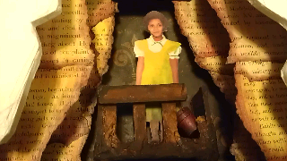
"Greener": third in a series
I'm tentatively calling this work "Greener", as in "the grass is always..."
 The focal image is a composite paint-over of my mother as a kid.
 My mother was forever looking at what other people had and assuming it had to be better. Even though by the standards of mid-century Lexington's black community, she was practically born with a silver spoon in her mouth. (She's in the front row of her class picture, third from the right.)
 At dinner, she used to spear bites off my dad's plate (my brother and I joked for years that her picking at his food was a major reason why my parents split up.) Same food: it just looked better on my dad's plate. I wanted to express that in the colors I used for this piece.
 Her favorite color was yellow -- she painted my room that color, and I spent many teenaged hours hating it -- so I gave her a yellow dress with green shadows to comment on her envy.
Envy is a poisonous emotion, but it's also melodramatic. Envy makes you the star of the story. So I used green's direct complement -- red -- to edge the paper and caulk "crags" of her cave. One of my stamp ink colors calls it "Lava Red" and I like the barely-contained churning image that evokes.
 I also designed the crags to hang like curtains in a theater, and placed the focal image in its broken-down balcony. (My mom was still a child when African-American movie-goers were required to sit in balcony seats, furthest from the screen and the white movie-goers.) In her left hand she holds a bucket of grudges.
 Her classmates stand below, just barely visible behind the mica "movie screen" showing the house in which she grew up.
 In the last class I took with Michael deMeng, he suggested mixing the grungy wash right on the substrate, instead of on a palette, to make it more uneven and random. I tried that, and dry-brushed a little lava black here and there on the yellow-painted caulk.
 For this piece, I decided to add metal feet. But as cute as they were in the package, I didn't want them to steal the show. I piled on caulk, then brought back some of the detail with paint washes.

Envy is a poisonous emotion, but it's also melodramatic. Envy makes you the star of the story. So I used green's direct complement -- red -- to edge the paper and caulk "crags" of her cave. One of my stamp ink colors calls it "Lava Red" and I like the barely-contained churning image that evokes.
So now it's baroque, but a craggy kind of baroque. And it's done before the new year!
I haven't yet looked into exhibitions to show this piece, but I'm sure something is just waiting around the corner. And that's about as far as I've planned the next year in art. Do you already have plans? Share in the comments or on Facebook.
All "Worked" out
Another season of "Work of Art" is in the can, and I don't know if I care whether it comes back. This season's winner: Kymia, bless her poor anxious self.
She was moody, yeah, but so genuinely open and appreciative when the judges liked her work. Even so, I still didn't connect with these contestants like I did with those from the first season. Not even enough to come up with mocking nicknames.
Yes, I watched, but in the same way I watch The Husband's cooking show competitions: see if I can predict the judges' criticisms. I hate to say it, but there didn't seem to be enough sociopaths or unreasonable deadlines. I am grateful for them scaling back on the absurdly obvious product placement. But man, Bravo has got to come up with a show-specific, compelling element. Otherwise I might as well be watching, I dunno, "Celebrity Cook-off." That one isn't even on the air yet, and I already know there's no reason to watch.
She was moody, yeah, but so genuinely open and appreciative when the judges liked her work. Even so, I still didn't connect with these contestants like I did with those from the first season. Not even enough to come up with mocking nicknames.
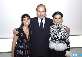 |
| Courtesy Bravo TV |